AVIRA
Avira Antivirus for Windows
My Role
UX Design
Product Design
Interaction Design (IxD)
UX Copywriting
Product Strategy
Team
Endpoint Protection
Product Manager
Andrey Belkin
Lead
Kai Brielmaier
THE SCOPE
and a bit of context
For many years, Avira’s main product was left in an “as it is” state, with only security and bug fixing acting as updates. This led to a performant but dated application.
Users were generally content with the product, but the lack of a modern UI and user-centric approach was making itself more and more present.
There has been an attempt at renewing the app, but after a year the company deemed it a failure, due to technical reasons.
Upon joining the Product Design team, I took over the bringing of the new UI and UX to life.
This meant the reworking of all the User flows, redesigning the User Interface and overall simplify the application as much as possible.
In short, the needs were the following:
- Decrease or stop user churn rate
- Maintain or increase quarterly revenue
- Create more touch points for upgrading
- Acquire more users
Even though the antivirus was present on all four major platforms (Windows, MacOS, Android, iOS), attention was concentrated on the Windows antivirus, which was responsible for 70%+ of the quarterly revenue.

THE PROCESS
and my role in it
When I took over the product, the product was so decrepit from a UI/UX standpoint that urgent action was needed. We quickly gathered and confirmed our assumptions about user needs and pain points .
Given the pressure, the urgency of the project and the background of the members of the teams, meetings with the management and stakeholders indicated that a mix of Design Thinking and Lean UX should be the most efficient way to approach the product.
In order to validate our assumptions and help define the problem, the following methods were employed, amongst others:
- Stakeholder interviews
- Interviews with the Tech Support team
- Actively doing Tech Support
- Study of Tech Support analytics
- Competitor analysis
- Heuristic UX review
- Persona review
In the span of a few meetings between the UX Research team, the Product Manager, the Product Owner and various stakeholders we decided on a set of metrics we would follow:
- Quarterly revenue
- Monthly active users (MAU)
- User churn rate
- Success rate
- Time to completion of a certain task
- Error rate
- User’s subjective satisfaction with the product
In order to get the buy-in from the upper management I did a vision of the product, clearly indicating the direction we would like to go from in term s of strategy, UX/UI and marketing.
The goal of the vision was to showcase
- Increased usability
- Decreased friction in the product
- Better UX
- A more modern UI
- Increased number of touchpoints with other products
- Competitivity in the market
- Overall product strategy
Different angles
of approach
In-depth learning
Learning the ins-and-outs of the app, especially since the documentation was only highly technical, if any.
Increase collaboration
The development teams with which I worked with had a hardcore programming background with no experience in working with a design or designer. Also the fact they were based in Germany added to the difficulty.
Following the vision
Creating and following an all encompassing vision of the product and the ecosystem in which it resided. Alignment with all the other products and visions in the Avira portfolio.
Simplification of flows and maintaining relevance of features
The security landscape has changed in the last years, with new threats and new methods to combat them appearing. Also user needs changed, as a reflection of the increasingly digital lifestyle.
Communication
and alignment
Given the fact the project was company-wide, I had to ensure the alignment between multiple entities
As a Product Designer, I worked on everything UX/UI

Research
Competitor analysis
Wireframing
Personas compliance

Flow design

UI (User Interface)

IxD (Interction Design)

Feature set

UX Copywriting
Co-create user tests
Data-driven insights
Stakeholder management
Traditionally, security software always had a reputation of being complex and complicated. Moreso, any change a user does in there has the potential of having a big impact on the overall security of your system. At the same time, as technology evolves, software tends to become more and more user friendly, therefore users don’t need to be as tech-savvy as before. PC users used to be pretty tech-savvy more than a decade ago. The PC environment demanded it and the software didn’t have the best UX neither.
However, with the advent of the modern smartphone, the app store, the Web 2.0 revolution, the popularization of terms like usability, UX, “joy-producing-experiences”, the desktop application landscape changed, reflecting what was happening in the web and mobile world. Applications became more streamlined and better built, trying to capitalise on better interfaces, logical interactions and improved information architecture.
Naturally, users quickly became accustomed to this and started expecting a certain level of sophistication in their apps. By way of consequence, the level of “tech savviness” started to decrease.
So it’s no wonder a big part of the Avira user base finds the application intimidating, cumbersome and non-intuitive. This had the following effect:
- The adoption rate for new users was in free fall
- The user churn rate was rising, as Avira was losing users to the competition
- Interaction with the touchpoints in the Avira ecosystem was at an all time low, which was reflected in the revenue
- The load on the Tech Support department was increasing
- Reviews were starting to reflect the overall bad UX
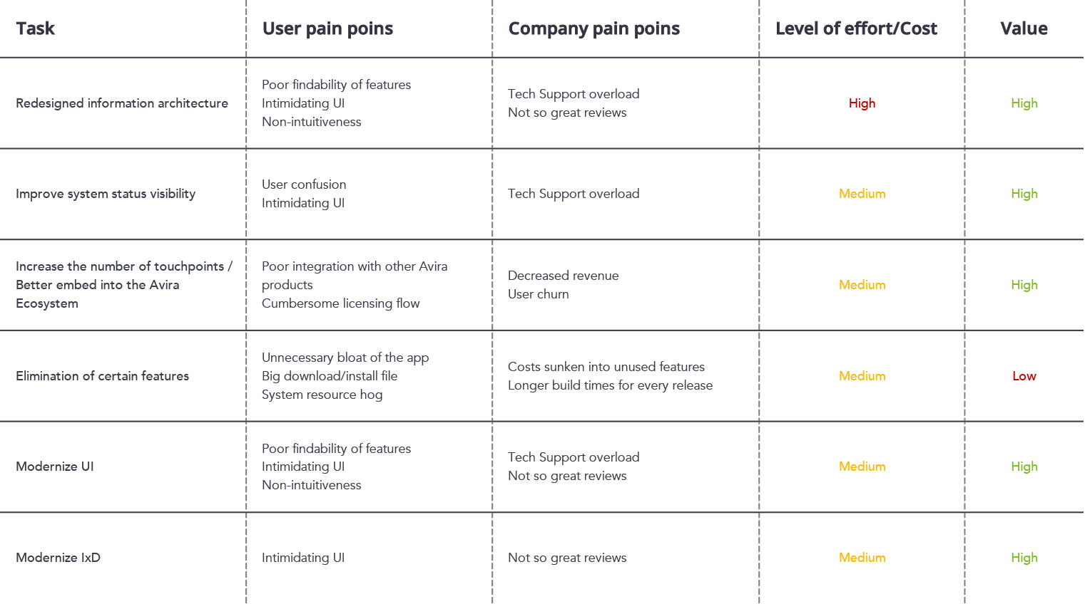
Concrete, actionable steps
Using a combination of Lean Business Canvas and Lean Prioritization Matrix, we synthesized the following actionable steps
THE USER TEST
and the conclusions
In collaboration with the User Research department we organised a test at the Schmiedl Marktforschung GmbH usability studio in Munich. The selected users were from all walks of life and all backgrounds, with which we tested an alpha version of the product.
Type of test: Comparative in-studio moderated usability test.
Metrics
- Task performance:
- task completion
- time on task
- ease of task
- Single Usability Metric (SUM: task completion, time on task & ease of task combined)
- usability issues
- Overall indicators:
- System Usability Scale (perceived ease of use)
- Avira CSAT (overall satisfaction)
- Avira NPS (customer loyalty)

Participants
N=22
Male: 9
Female: 13

Age
40% Milennials
40% GenX
20% baby Boomers

Country
Germany
German language

Employment
Fulltime: 17
Part time: 2
Student: 3

Persona affinity
Emma: 60%
None: 25%

Internet usage

Windows version

Antivirus software
Competitor: 12
For the overall perceived ease of use, the SUS Scale (System Usability Scale) was used

And for the overall satisfaction, Avira CSAT
Old UI
CSAT score: 2.8
GOOD
New UI
CSAT score: 2.1
VERY GOOD
Key findings
The test had various scenarios that had users perform a series of tasks.
Below you can see the success rates.
Of course, issues were uncovered – UI, UX, copywriting/localization, development – and they were addressed as fast as possible.
CONCLUSION
and the next steps
By this time all the teams really hit their stride and the velocity increased, so we were able to iron out many issues discovered in the user test.
In September 2017 we rolled out the first stage of the new UI with a very positive feedback from the users and professional reviewers.
The launch was the culmination of less than one year of working intensely and under pressure, agile planning and finally execution. It was truly a collaborative process with multiple inter-disciplinary teams in two countries.
As future steps, the rest of the UI has to be implemented. This time there won’t be any time pressure, so proper methodology should be respected much more easily.